Last updated
Add a new listing wizard tab
Learn how to add a new tab to the listing creation wizard.
Table of Contents
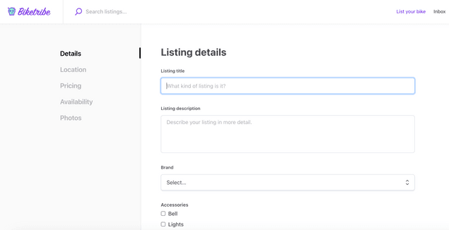
The template has default tabs in the listing creation wizard for both bookings and purchases. The first of those tabs, “Details” shows the attributes you have configured for your marketplace listings in Flex Console. However, you can also add custom tabs to the listing creation flow.
In addition to having a listing description, we want to allow providers to explain any potential extra features of their rental bike in more detail.
In this tutorial, you will
- Add EditListingExtraFeaturesPanel and EditListingExtraFeaturesForm components
- Use the new panel in EditListingWizard
- Show the listing’s extra features on the listing page with the SectionTextMaybe component
Information
This tutorial uses the following marketplace configurations:
- Layout > Listing page image layout: Image carousel with thumbnails
- Listing types > Transaction process: Calendar booking
Add EditListingExtraFeaturesPanel and EditListingExtraFeaturesForm
The different listing wizard panels can be found in the EditListingPage folder under EditListingWizard.
└── src
    └── containers
        └── EditListingPage
            └── EditListingWizard
                ├── …
                ├── EditListingAvailabilityPanel
                ├── EditListingDeliveryPanel
                ├── EditListingDetailsPanel
                ├── …
Each panel has the same structure:
- EditListing[...]Panel.js and .module.css
- EditListing[...]Form.js, .example.js, .test.js, and .module.css
In this tutorial, we will use the following files.
- EditListingExtraFeaturesPanel.js
- EditListingExtraFeaturesPanel.module.css
- EditListingExtraFeaturesForm.js
- EditListingExtraFeaturesForm.module.css
Create a new folder titled EditListingExtraFeaturesPanel in the EditListingWizard folder. Add the above files into the new folder.
└── src
    └── containers
        └── EditListingPage
            └── EditListingWizard
                └── EditListingExtraFeaturesPanel
                    ├── EditListingExtraFeaturesPanel.js
├── …If you want to add EditListingExtraFeaturesForm.example.js and EditListingExtraFeaturesForm.test.js files as well, you can download them here
This section will go through EditListingExtraFeaturesPanel in more detail.
First, we import the necessary elements used in the file. In this
section, all rows start with import.
Next, we create a helper function getInitialValues to return any
existing value of the extra features from the listing's public data.
const getInitialValues = params => {
  const { listing } = params;
  const { extraFeatures } = listing?.attributes.publicData || {};

  return { extraFeatures };
};
Then, we create the component itself. We first use destructuring assignment to set our props into constants for ease of use. We also create a handful of other constants to then pass to the returned element.
const EditListingExtraFeaturesPanel = props => {
  const {
    className,
    rootClassName,
    listing,
    disabled,
    ready,
    onSubmit,
    submitButtonText,
    panelUpdated,
    updateInProgress,
    errors,
  } = props;

  const classes = classNames(rootClassName || css.root, className);
  const initialValues = getInitialValues(props);
  const isPublished = listing?.id && listing?.attributes?.state !== LISTING_STATE_DRAFT;
  const unitType = listing?.attributes?.publicData?.unitType;
The second half of the component is the returned element. First, we show a title that depends on whether the listing has been published or not. Then, we show the actual EditListingExtraFeaturesForm.
In the form onSubmit function, we again use destructuring assignment for retrieving the value of extraFeatures from the incoming values, and then set extraFeatures as an attribute for publicData before calling the onSubmit function received as a prop.
  return (
    <div className={classes}>
      <H3 as="h1">
        {isPublished ? (
          <FormattedMessage
            id="EditListingExtraFeaturesPanel.title"
            values={{ listingTitle: <ListingLink listing={listing} />, lineBreak: <br /> }}
          />
        ) : (
          <FormattedMessage
            id="EditListingExtraFeaturesPanel.createListingTitle"
            values={{ lineBreak: <br /> }}
          />
        )}
      </H3>
      <EditListingExtraFeaturesForm
        className={css.form}
        initialValues={initialValues}
        onSubmit={values => {
          const { extraFeatures = '' } = values;

          // New values for listing attributes
          const updateValues = {
            publicData: {
              extraFeatures
            }
          };
          onSubmit(updateValues);
        }}
        unitType={unitType}
        saveActionMsg={submitButtonText}
        disabled={disabled}
        ready={ready}
        updated={panelUpdated}
        updateInProgress={updateInProgress}
        fetchErrors={errors}
      />
    </div>
  );
};
The rest of the file defines the necessary props more closely, and finally exports the component.
This section will go through EditListingExtraFeaturesForm in more detail.
First, we import the necessary elements used in the file. In this
section, all rows start with import.
Then, we create the form component. Forms in the Sharetribe Web Template use the Final Form library for form state management. This means that on the highest level, we directly return a FinalForm component from our EditListingExtraFeaturesFormComponent. We then use the FinalForm component's render prop to customise our Extra features form behavior.
export const EditListingExtraFeaturesFormComponent = props => (
  <FinalForm
    {...props}
    render={formRenderProps => {
      const {
        formId,
        autoFocus,
        className,
        disabled,
        ready,
        handleSubmit,
        intl,
        invalid,
        pristine,
        saveActionMsg,
        updated,
        updateInProgress,
        fetchErrors,
      } = formRenderProps;

      const classes = classNames(css.root, className);
      const submitReady = (updated && pristine) || ready;
      const submitInProgress = updateInProgress;
      const submitDisabled = invalid || disabled || submitInProgress;
      const { updateListingError, showListingsError } = fetchErrors || {};
Above, we have defined the necessary constants to use in the form. It is good to note that the EditListingExtraFeaturesForm component receives an onSubmit prop, defined in EditListingExtraFeaturesPanel, that gets passed directly to the FinalForm component. The FinalForm component wraps that prop as the handleSubmit form render prop, which we then pass to the actual Form as onSubmit.
The form itself contains only one text field, and the submit button. In addition, we show any errors from props.
      return (
        <Form onSubmit={handleSubmit} className={classes}>
          {updateListingError ? (
            <p className={css.error}>
              <FormattedMessage id="EditListingExtraFeaturesForm.updateFailed" />
            </p>
          ) : null}
          {showListingsError ? (
            <p className={css.error}>
              <FormattedMessage id="EditListingExtraFeaturesForm.showListingFailed" />
            </p>
          ) : null}
          <FieldTextInput
            id={`${formId}extraFeatures`}
            name="extraFeatures"
            className={css.input}
            autoFocus={autoFocus}
            type="textarea"
            label="Extra features"
            placeholder={intl.formatMessage({ id: 'EditListingExtraFeaturesForm.extraFeaturesInputPlaceholder' })}
          />

          <Button
            className={css.submitButton}
            type="submit"
            inProgress={submitInProgress}
            disabled={submitDisabled}
            ready={submitReady}
          >
            {saveActionMsg}
          </Button>
        </Form>
      );
    }}
  />
);
The rest of the file defines the necessary props more closely, and finally exports the component. Since the form uses microcopy, and therefore needs the intl object, we need to compose injectIntl when exporting the component.
export default compose(injectIntl)(
  EditListingExtraFeaturesFormComponent
);
Use the new panel in EditListingWizard
When a provider creates their listing, they navigate through the Edit Listing Wizard. The wizard has a layered structure:
- EditListingWizardTab component imports all different listing edit
panels, and determines which one to render based on a
tabprop - EditListingWizard component imports and shows the EditListingWizardTab component and an array of supported tabs, as well as navigation and the Stripe onboarding parts of the wizard
So to use our new EditListingExtraFeaturesPanel component, we need to
- import it in the EditListingWizardTab component
- render it in the correct context, and
- add
EXTRAFEATURESto the list of supported tabs
Add EditListingExtraFeaturesPanel to EditListingWizardTab
First, import the EditListingExtraFeaturesPanel component in EditListingWizardTab.
└── src
    └── containers
        └── EditListingPage
            └── EditListingWizard
                ├── EditListingWizardTab.js
                ├── …
import EditListingPricingPanel from './EditListingPricingPanel/EditListingPricingPanel';
import EditListingPricingAndStockPanel from './EditListingPricingAndStockPanel EditListingPricingAndStockPanel';
+ import EditListingExtraFeaturesPanel from './EditListingExtraFeaturesPanel/EditListingExtraFeaturesPanel';
The EditListingWizardTab component also exports constants for all supported panels, so let’s add the new EXTRAFEATURES panel in that list, as well as into the SUPPORTED_TABS array.
export const DETAILS = 'details';
export const PRICING = 'pricing';
export const PRICING_AND_STOCK = 'pricing-and-stock';
export const EXTRAFEATURES = 'extra-features';
export const DELIVERY = 'delivery';
export const LOCATION = 'location';
export const AVAILABILITY = 'availability';
export const PHOTOS = 'photos';

// EditListingWizardTab component supports these tabs
export const SUPPORTED_TABS = [
  DETAILS,
  PRICING,
  PRICING_AND_STOCK,
  EXTRAFEATURES,
  DELIVERY,
  LOCATION,
  AVAILABILITY,
  PHOTOS,
];
The core of the EditListingWizardTab component is a switch statement
that determines, based on the tab prop, which panel component to
return. Add the following code block to the switch statement, before the
default: row:
…
    case PHOTOS: {
      return (
        <EditListingPhotosPanel
          {...panelProps(PHOTOS)}
          listingImageConfig={config.layout.listingImage}
          images={images}
          onImageUpload={onImageUpload}
          onRemoveImage={onRemoveImage}
        />
      );
    }
    case EXTRAFEATURES: {
      return (
        <EditListingExtraFeaturesPanel
          {...panelProps(EXTRAFEATURES)}
        />
      );
    }
    default:
      return null;
  }
Show EditListingExtraFeaturesPanel in EditListingWizard
Almost there! We still need to add the EXTRAFEATURES tab handling to EditListingWizard.
└── src
    └── containers
        └── EditListingPage
            └── EditListingWizard
                ├── EditListingWizard.js
                ├── …
Let’s start by importing the relevant constant from EditListingWizardTab.
// Import modules from this directory
import EditListingWizardTab, {
  DETAILS,
  PRICING,
  PRICING_AND_STOCK,
  DELIVERY,
  EXTRAFEATURES,
  LOCATION,
  AVAILABILITY,
  PHOTOS,
} from './EditListingWizardTab';
Next, add the EXTRAFEATURES tab to the existing TABS_BOOKING array.
const TABS_DETAILS_ONLY = [DETAILS];
const TABS_PRODUCT = [DETAILS, PRICING_AND_STOCK, DELIVERY, PHOTOS];
const TABS_BOOKING = [
  DETAILS,
  LOCATION,
  PRICING,
  EXTRAFEATURES,
  AVAILABILITY,
  PHOTOS,
];
const TABS_ALL = [...TABS_PRODUCT, ...TABS_BOOKING];
The EditListingWizard component checks the tab value in two functions: tabLabelAndSubmit and tabCompleted.
The tabLabelAndSubmit function determines the microcopy keys for the
tab label and the submit button. Add the following block in the if-else
sequence:
else if (tab === EXTRAFEATURES) {
    labelKey = 'EditListingWizard.tabLabelExtraFeatures';
    submitButtonKey = `EditListingWizard.${processNameString}${newOrEdit}.saveExtraFeatures`;
  }
The tabCompleted function checks whether a specific wizard tab is
completed. The way it checks this is by verifying whether the listing
has values in the necessary attributes.
Since the EditListingExtraFeaturesPanel is not a required attribute, we
we will add a case to the switch statement and just return true
whether or not it has a value. The panel saves the extra feature
information in the listing’s publicData under the extraFeatures
attribute, so if this was a required feature, we would check whether
publicData.extraFeatures has a value.
…
    case PHOTOS:
      return images && images.length > 0;
    case EXTRAFEATURES:
      return true;
      // /** For a required attribute: **/
      // return !!publicData.extraFeatures;
    default:
      return false;
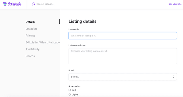
Now, if you start creating a new listing, you’ll see a new tab label in the left side navigation. However, the label only shows the relevant microcopy key, since we have not yet added the microcopy values in Flex Console.
To fix this, add the following keys and values in your Flex Console > Build > Content > Microcopy editor or src/translations/en.json file:
  "EditListingWizard.tabLabelExtraFeatures": "Extra features",
  "EditListingExtraFeaturesPanel.createListingTitle": "Extra features",
  "EditListingExtraFeaturesPanel.title": "Edit the extra features of {listingTitle}",
  "EditListingExtraFeaturesForm.extraFeaturesInputPlaceholder": "Explain your bike extra features...",
  "EditListingExtraFeaturesForm.updateFailed": "Updating listing failed",
  "EditListingExtraFeaturesForm.showListingFailed": "Fetching listing failed",
  "EditListingWizard.default-booking.new.savePricing": "Next: Extra features",
  "EditListingWizard.default-booking.new.saveExtraFeatures": "Next: Availability",
  "EditListingWizard.edit.saveExtraFeatures": "Save changes",
  "ListingPage.extraFeaturesTitle": "Extra features"
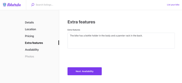
After adding these microcopy keys and values, you can create and edit the extra features of a listing. You can test the panel functionality by saving some extra features for the listing.
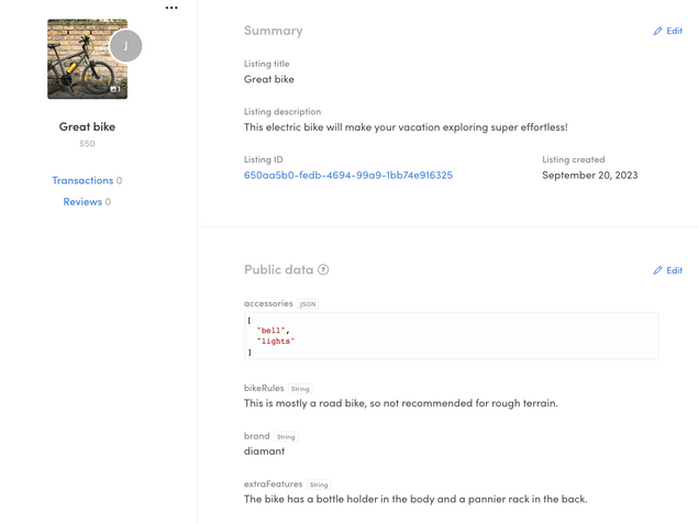
When you now view the bike in your Flex Console > Manage > Listings, you can see the extra features get saved in the listing's public data.
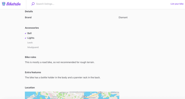
Show Extra features on listing page with SectionTextMaybe component
Now that the listing has extra features, we want to show them on the listing page. To do that, we will need to add a section to the listing page that displays the extra features. We have configured our marketplace to use the screen-wide cover photo layout, so we will modify the ListingPageCoverPhoto.js file.
└── src
    └── containers
        └── ListingPage
            ├── ListingPageCarousel.js
            ├── …
The listing pages, ListingPageCarousel and ListingPageCoverPhoto (which
corresponds to the "Screen wide cover photo" layout option), show
listing data using Section components, which render different types of
data in a predefined way. Since the bike extra features data is free
text, we can use the pre-existing SectionTextMaybe component to
display the extra features.
Add the following code snippet above the SectionMapMaybe component in ListingPageCarousel:
<SectionTextMaybe
  text={publicData.extraFeatures}
  heading={intl.formatMessage({ id: 'ListingPage.extraFeaturesTitle' })}
/>
You can now see the listing extra features displayed on the listing page.
Summary
In this tutorial, you
- Added a new EditListingWizard panel, the related form, and the relevant css files
- Edited EditListingWizardTab to support the new panel
- Edited EditListingWizard to
- show the correct labels and
- check whether the listing has the necessary information related to the new panel
- Added microcopy strings for the different texts related to the new panel
- Used SectionTextMaybe on the listing page for displaying the extra features
